Unlocking the Secrets of Fonts: Exploring Alternatives to 12Pt Times New Roman
As writers, designers, and communication professionals, we are often bound by the constraints of font choices in our industry. For decades, 12-point Times New Roman has been the de facto standard for academic and professional writing. However, this monotonous font choice has been the subject of much debate, with many arguing that it lacks the flair and sophistication required to engage modern audiences. In this article, we will delve into the world of font alternatives and explore the best options to replace 12Pt Times New Roman.
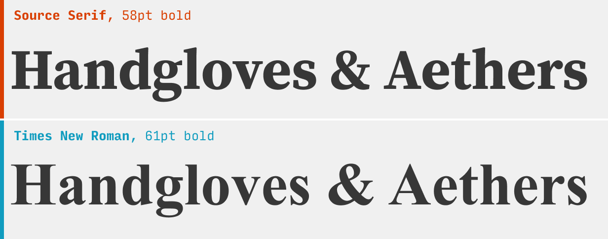
Times New Roman, designed in 1931 by Stanley Morison for The Times of London, has been the go-to font for typesetting and printing since the early 20th century. Its clear, readable, and reliable nature has made it a staple in the world of publishing. However, the proliferation of digital media and the rise of visual communication have rendered Times New Roman somewhat outdated. Today, designers and writers are seeking fonts that exude style, personality, and flexibility, rather than simply adhering to the conventional standard.
One of the main reasons for the rise of font alternatives is the explosion of digital media. With the advent of social media, email, and online publishing, our written communication has become increasingly visual. Fonts now have the power to convey tone, personality, and emotion, making it essential for professionals to have a diverse range of font options at their disposal.
As Janine Iversen, a renowned graphic designer, notes: "Fonts are no longer just a means of communication; they've become a language in themselves. The right font can evoke emotions, convey personality, and establish a brand identity. With the proliferation of digital media, the need for versatility and creativity in font choices has never been more pressing."
The Benefits of Font Alternatives
1. Visual Appeal
Fonts play a significant role in capturing the attention of readers and conveying the tone of a piece. A well-chosen font can elevate the visual appeal of a document, making it more engaging and memorable. In contrast, a font like Times New Roman can often come across as dull and uninspired.
2. Personality and Tone
Fonts can convey a range of emotions and personality traits, from formal and professional to playful and whimsical. By choosing a font that reflects the tone and personality of a piece, writers and designers can create a more immersive experience for their audience.
3. Legibility and Readability
While Times New Roman is certainly legible, many alternative fonts offer improved readability and visual flow. For example, fonts with rounded edges and subtle curves can reduce eye strain and make text more scannable.
4. Brand Identity
Fonts are an integral part of brand identity, and choosing the right font can help establish a unique visual language for a business or organization. By selecting a font that aligns with their brand values and personality, companies can create a cohesive and recognizable visual presence.
Popular Font Alternatives
1. Arial and Helvetica
For those seeking a font with a similar neutral tone to Times New Roman, Arial and Helvetica are popular alternatives. While not as ornate as some other fonts, these sans-serif fonts offer a clean and modern aesthetic.
2. Georgia and Garamond
For a more classic and traditional look, Georgia and Garamond are excellent options. These serif fonts are reminiscent of 19th-century printing and offer a sophisticated, elegant feel.
3. Montserrat and Open Sans
For a more contemporary and urban feel, Montserrat and Open Sans are excellent choices. These fonts are designed for digital media and offer a clean, modern aesthetic with a touch of edge.
4. Calibri and Candara
For a more whimsical and playful feel, Calibri and Candara are great options. These fonts are designed for creative and artistic applications and offer a unique, hand-drawn feel.
Best Practices for Choosing Font Alternatives
When selecting a font alternative, it's essential to consider the context and purpose of your writing or design. Here are some best practices to keep in mind:
1. Consider the Tone and Personality
Choose a font that reflects the tone and personality of your piece. For example, a formal academic article may require a more traditional font, while a creative or humorous piece may benefit from a more playful font.
2. Think About Legibility and Readability
Select a font that is clear and easy to read. Consider the font's x-height, letter spacing, and line height to ensure optimal readability.
3. Check Font Compatibility
Ensure that your chosen font is compatible with the platforms and software you'll be using. Some fonts may not display or print correctly in certain applications.
4. Be Mindful of Brand Identity
Choose a font that aligns with your brand values and personality. Consistency is key in building a strong brand identity.
Conclusion
In conclusion, the world of font alternatives is vast and exciting, offering a range of options to suit every need and style. Whether you're a writer, designer, or communication professional, choosing the right font can make all the difference in engaging your audience and conveying your message. By exploring the benefits of font alternatives and considering the best practices for selection, you can unlock the secrets of fonts and elevate your visual communication to new heights.